News
Summers Will Not Finish Semester of Teaching as Harvard Investigates Epstein Ties

News
Harvard College Students Report Favoring Divestment from Israel in HUA Survey

News
‘He Should Resign’: Harvard Undergrads Take Hard Line Against Summers Over Epstein Scandal

News
Harvard To Launch New Investigation Into Epstein’s Ties to Summers, Other University Affiliates

News
Harvard Students To Vote on Divestment From Israel in Inaugural HUA Election Survey
Book Cover Round-Up

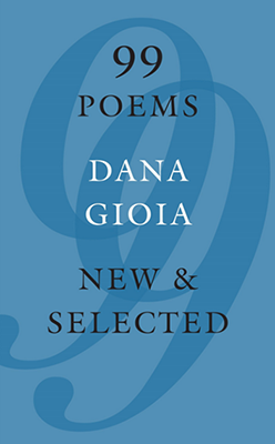
99 Poems: March 1, 2016
Poetry can sometimes be daunting even for seasoned literary connoisseurs, but Dana Gioia’s book wants to be accessible to everyone on the literary spectrum, from book-burners to college students. (Given that you may need to have read a book to decide that you hate it enough to burn it, you all can decide which end of the spectrum is which.) For the perhaps more mathematically-challenged bibliophiles, the number of poems, “99,” is subtly yet distinctly re-printed in a large, opaque font for easy comprehension. For those less familiar with complex diction and allusive devices, Gioia kindly opts out of a self-referential literary title and spares us the task of analyzing images. Sometimes two plus two equals four, a cigar is just a cigar, and there are probably just 99 poems in a book titled “99 Poems.” The only potential points of confusion for any reader are the metaphorical meanings of the alternating black and white font and that particular shade of blue. Black and white, perhaps, to symbolize the ever-metamorphosizing, sometimes drastically changing nature of a genre? Was “poetry” the same art form when Gioia published the first of these poems as when he published the last? How did the masses receive poetry? What is poetry, really? The background periwinkle color might give us more insight into these themes of temporality and popular culture: Crayola added periwinkle to its official palette in 1949, just one year before Gioia’s birth. This analytical task stretches us a little but still leave us energy to read the volume cover to cover as fast as possible, as all collections—and especially poems—are supposed to be read. It’s an all-around winner.
The Throwback Special: March 14, 2016
The bold and mysterious cover of “The Throwback Special” stays true to its themes of the American male psyche. The novel centers around (American) football, but its cover lacks both the familiar soul- and phallus-stirring oblong shape and its charming coyote-and-cream color scheme. Instead it provides us a brilliant, subtle reference to femininity—so subtle, in fact, that it is literally the background—in the choice of a stunning, fertile green color. Hasty interpreters might think the shade mirrors that of Astroturf; we must note, however, that the font itself comprises loops reminiscent of shapes prevalent in female fashion and anatomy. In this context, the green can refer only to the Earth and fertility, presenting a strong female subtext to serve as a foil for the novel’s content. Or perhaps it foreshadows revolutionary psychological insights into the feminizing effects of American football. Intrepid readers will simply have to meet Bachelder’s publishers halfway and open the cover flap to find out, just as we will have to meet Bachelder halfway in the story, working past our stereotypes through the simple yet shockingly refreshing and never-before-done juxtaposition of American males and sports.
Imagine Me Gone: May 3, 2016
This one sounds a bit like a potential Adele track title, and like Adele album covers, it shuns color. The cover features the black text “Imagine/Me/Gone,” written “IMAGI E/ME/G NE,” on a bleak, soulless white background. The missing letters spell NO. NO, we can’t imagine you gone? NO, we won’t imagine you gone? NO, you aren’t gone? N(ever mind I’ll find s)O(meone like you)? The slightly depressing—-if not downright morbid—-possibilities are endless. You’ll be singing sadly and seeing the world in sepia before you read a single word of this highly-acclaimed and anticipated novel.
Rich and Pretty: June 7, 2016
“Rich and Pretty” is about two girls, Sarah and Lauren, who are, respectively, rich and pretty. The cover features two girls in its background, thin calves bared mid-stride and faces turned away from our prying eyes. What it doesn’t tell us: Who’s the rich one, and who’s the pretty one? One has a bob and another a lob; one wears pink, the other navy. Which hairstyle and color palette should we emulate if we aspire to be considered “pretty”? Do all rich people dress like that? These are important questions that most of us care about, so most of us will probably read the book after seeing its cover.
Want to keep up with breaking news? Subscribe to our email newsletter.


