
News
Summers Will Not Finish Semester of Teaching as Harvard Investigates Epstein Ties

News
Harvard College Students Report Favoring Divestment from Israel in HUA Survey

News
‘He Should Resign’: Harvard Undergrads Take Hard Line Against Summers Over Epstein Scandal
News
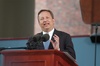
Harvard To Launch New Investigation Into Epstein’s Ties to Summers, Other University Affiliates

News
Harvard Students To Vote on Divestment From Israel in Inaugural HUA Election Survey
The Crimson Bookshelf
FIRST PRINCIPLES OF TYPOGRAPHY, by Stanley Morison, New York. The Macmillan Company. $1.00. 1936.
ORIGINALLY written for those outside the trade, this little "attempt at a rationale of book-typography" has reached a position of respect among eminent practicing printers. In 29 pages Mr. Morison lays down the laws of typography with consummate skill. For the layman the chief delight of his essay is in its effective demolition of the school of so-called "fine printing" Mr. Morison fulminates so beautifully against tricky type-fonts, odd proportions of type and page, misplaced color and the rough edges of handmade paper that it is reasonable to assume any journeyman reader of his remarks will think twice before committing these sins.
"Typography", says Mr. Morison, "May be defined as the craft of rightly disposing printing material in accordance with specific purpose; of so arranging the letters, distributing the space and controlling the type as to aid to the maximum the readers comprehension of the text. Typography is the efficient means to as essentially utilitarian and only accidentally aesthetic end, for enjoyment of patterns is rarely the reader's chief aim. Therefore, any disposition of printing material which, whatever the intention, has the effect of coming between author and reader is wrong. It follows that is the printing of books meant to be read there is little room for "bright" typography. Even dullness and monotony is the typesetting are far less vicious to a reader than typographical eccentricity or pleasantry".
Want to keep up with breaking news? Subscribe to our email newsletter.